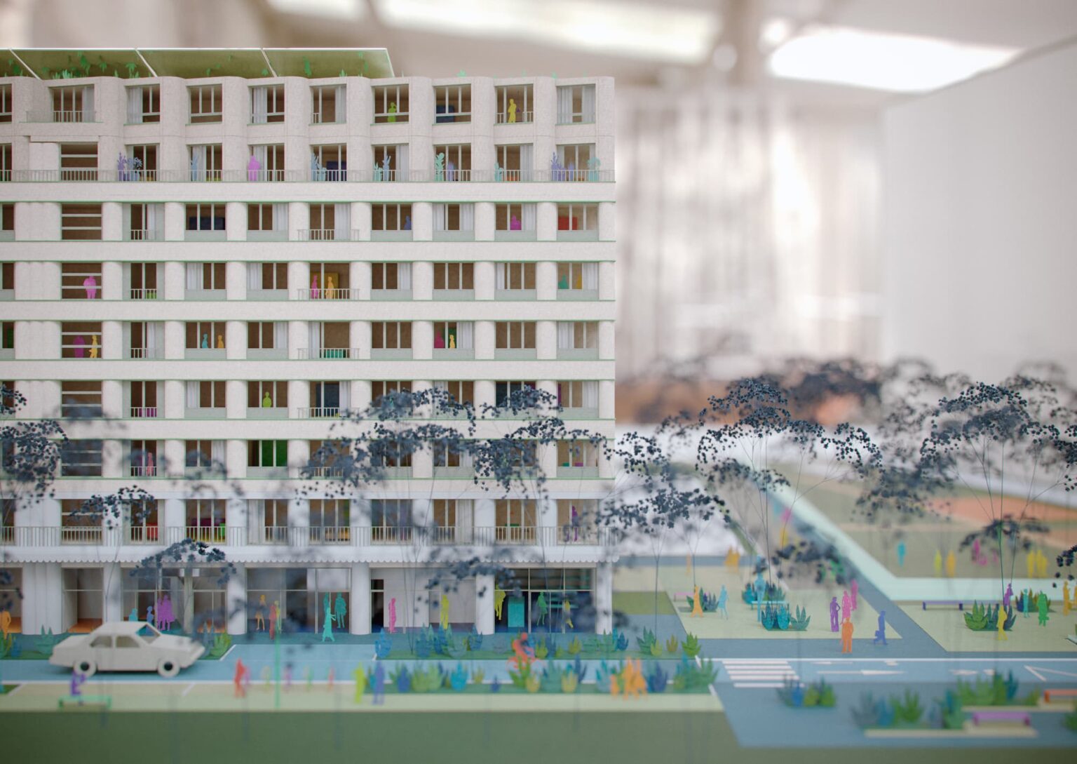
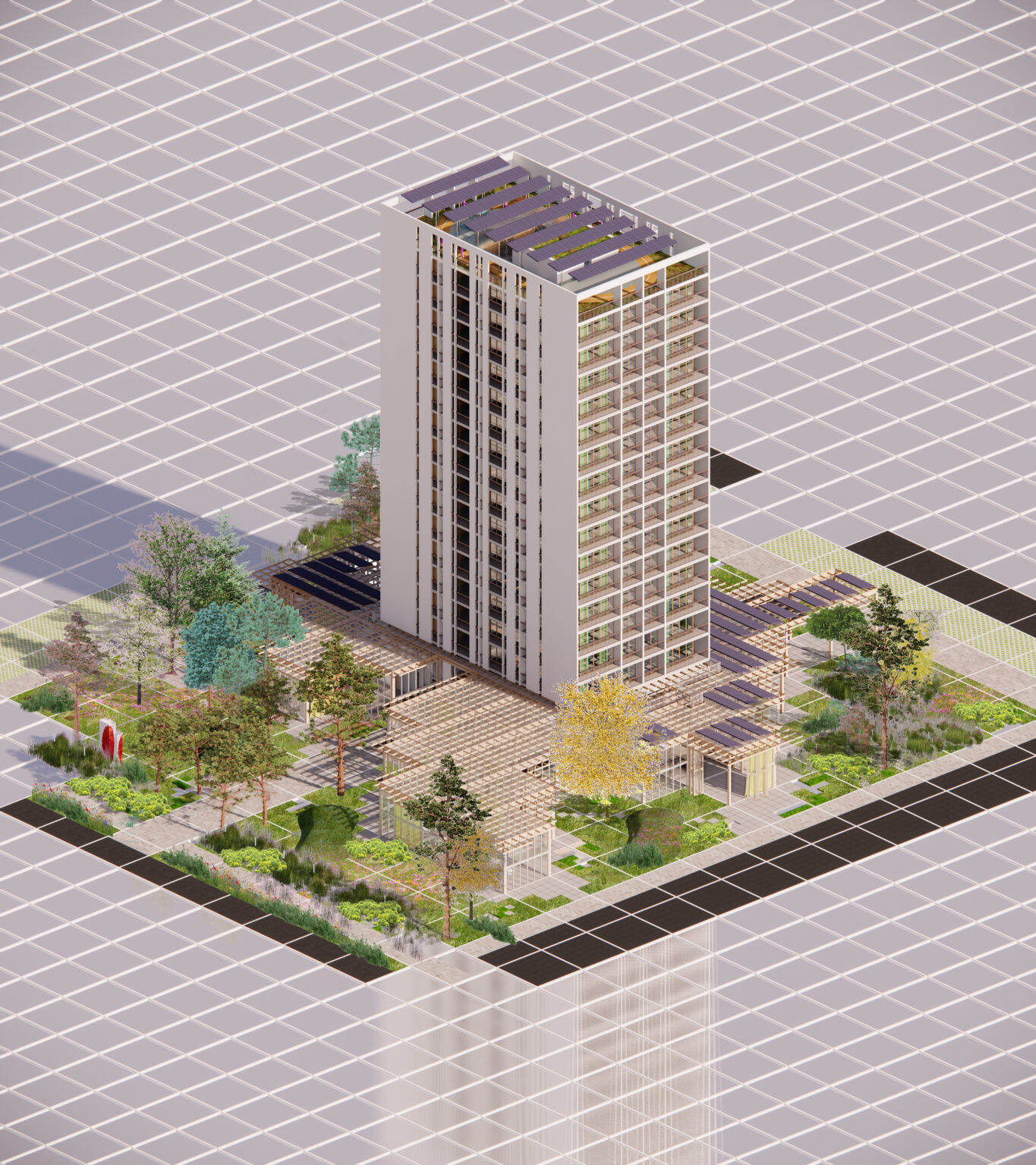
With a project that is inclusive and open to the city and a high level of environmental performance, the consortium aims to develop the first "mission" property complex in Paris, thanks to a mixed-use program, open to the city, inclusive and supportive: social housing, a residence for young working people, a women's center, a supportive drop-in center, a supportive concierge service, offices, local shops, services, a covered market, an ESS, a health center, a mobility center, etc. This renovation embodies the environmental transformation of Haussmann's Paris, and is already compatible with the future bioclimatic PLU of the City of Paris, which will come into force in 2024.
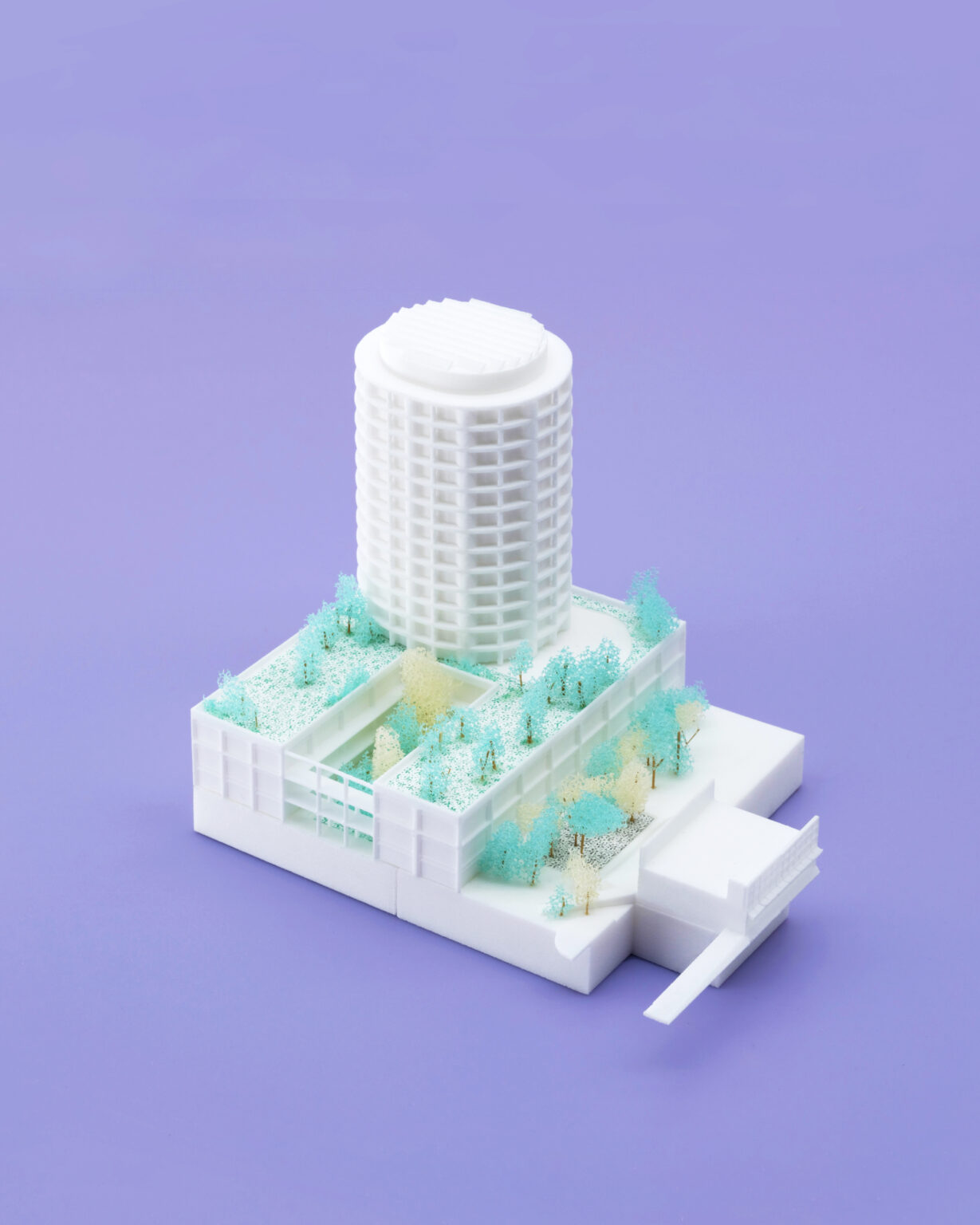
Our project envisions architecture as a space for thoughtful coexistence — between the history of the place, the climate, the available resources, and the diversity of those who inhabit and shape it. The circular tower, with its unfolded and deep façade, faces all sides of the city without hierarchy. The Station opens onto the future square, while the light industrial building fits into the shared scale of the new neighborhood. The MU collective has turned the Station into a landmark for activist and festive life. The project seeks to sustain this vibrant energy of musical, artistic, and cultural margins. The architectural forms and low-tech processes used in the project reflect a deep synergy with the climatic environment. Alongside the programs of housing, workshops, and spaces for celebration, a constellation of outdoor and semi-outdoor areas takes shape: enclosed yet open to the sky, or roofed yet permeable, alongside tree-filled landscapes and courtyards that invite appropriation, with some planted areas designed for gardening and others preserved as sanctuaries. Through its diverse microclimates, the project orchestrates moments of connection with what is most metropolitan and emancipatory in the city: being here, with others.
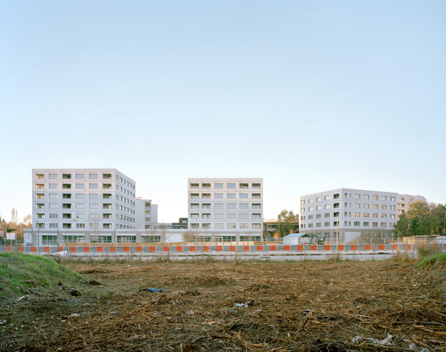
This project is located on the edge of a square, at the future heart of the neighborhood. It articulates two scales: urban and architectural. The first floor is a covered gallery that defines the public space, its orientation. The shops installed on the ground floor enjoy a direct opening on the nearby vegetable garden. A grove has been preserved and becomes part of the green archipelago that will make up this future bit of town. On this retained farmland, three buildings grow vertically. The cost-efficient use of common materials makes it possible to develop larger, more open, adaptable housing. The appearance of the construction is deliberately ordinary and unadorned.
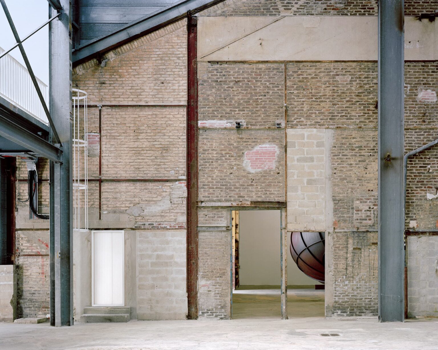
Demolishing, adding, removing and maintaining are all acts of architecture. The project affirms the equivalent consideration of all that remains. It's a matter of arranging situations appropriately, with all the elements present, of paying attention to all things, without distinction. As a preamble to any intervention, the renovation protocol involves considering the existing qualities of the site, and grasping its history. This necessary work of investigation and observation makes it possible to understand the morphological evolutions and characteristics of this collection of industrial architectures, so as to better update them. The renovation of the site involves a range of targeted interventions to maintain the site's dynamic character: reopening the Moulin to the river, diversifying the volume of the spaces and enhancing the character of each room. The project combines a technical update of the buildings (structural repairs, roof renovation) with a re-articulation of spaces to better accommodate works of art and visitors. Demolishing a roof, opening up perspectives, adding staircases, connecting spaces, landscaping the surroundings with the construction of a skatepark and opening up bays are just some of the operations implemented to multiply situations and uses.
As a preamble to any intervention, the renovation protocol involves considering the existing qualities of the site, and grasping its history. This necessary work of investigation and observation makes it possible to understand the morphological evolutions and characteristics of this collection of industrial architectures, so as to better update them. The renovation of the site involves a range of targeted interventions to maintain the site's dynamic character: reopening the Moulin to the river, diversifying the volume of the spaces and enhancing the character of each room. The project combines a technical update of the buildings (structural repairs, roof renovation) with a re-articulation of spaces to better accommodate works of art and visitors. Demolishing a roof, opening up perspectives, adding staircases, connecting spaces, landscaping the surroundings with the construction of a skatepark and opening up bays are just some of the operations implemented to multiply situations and uses.
On the main square of the city, an ephemeral hall of 1000sqm is built within three days. Its inclined structure extends the roof, which has become a façade, towards the public space. Covered with a translucent fabric and mirror textile, the stretched surface welcomes the reflections of the changing sky. Inside, the rectilinear space is punctuated by 15 aluminum porticos. Widely open, the inclined hall becomes a place for debate and information on the future of the metropolis. Occupied by a building as wide as itself, the Place du Capitole is for a time invested by the population. In one night, the building is dismantled.
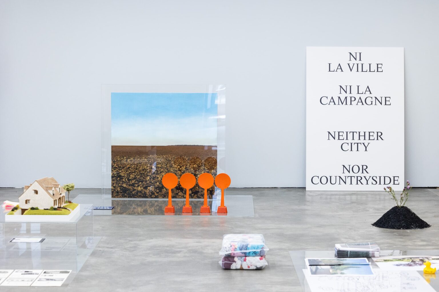
From 1960 to 2030, the exhibition traces the rapid metropolitanization of the city of Toulouse. The research combines urban and demographic data with a field study and a photographic mission that testify to the landscape resulting from this “metropolitan shock”. In order to think about the future of the city, the exhibition brings together a series of architectural and urban examples from the world's metropolises around the themes of housing, transportation, landscape, work spaces and agriculture. A program of conferences combines the interventions of various experts from the fields of geography, landscape and architecture, such as Rem Koolhaas, Jean-Pierre Vassal, Dominique Jakob or Alain Bourdin.
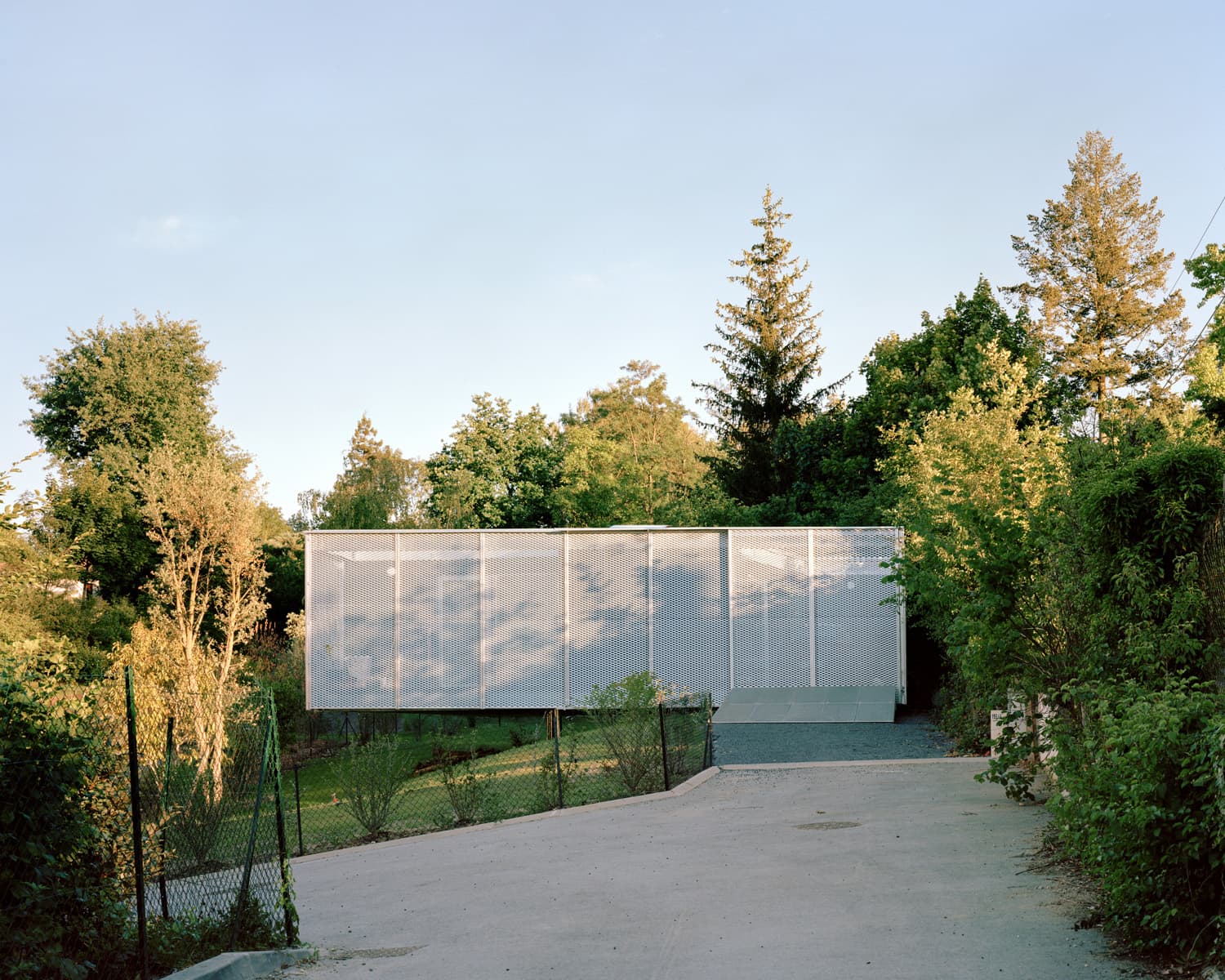
A hilly plot of land on the edge of a metropolis is crossed by a talweg, which conducts water from the slopes underground, and by traces of an ancient Roman road. Two parcels have been awkwardly carved up. Their administrative and land- ownership situation contrasts with the geology of the terrain. The building zone is located on a slope, the upper part of which is wooded and overlooks wetlands irrigated by a stream. The house is a small volume set on this complex terrain, with the aim of altering it as little as possible. The house is a metal and wood structure, partly prefabricated in the workshop, delivered and placed on stilts. The main metal framework ensures the rigidity of the volume, while the secondary wooden framework forms the partitions and facades. The house is positioned on the slope. Without cutting down trees or shaping the land, it rests on the upper part of the slope and cantilevers out. It is designed as a simple volume whose four identical facades are punctuated by stretched expanded-metal frames, some of which slide along the facade like shutters. The interior layout revolves around a polygonal common room, surrounded by the seven indoor/outdoor rooms that make it up: bedroom, courtyard, bathroom, study, kitchen, balcony and terrace. The metal facades filter views towards the nearby buildings to the North and the East. When night falls, the expanded metal volume reveals the silhouettes of objects and inhabitants. The car, the plants, the kitchen, the washing machine... everything is welcomed into this domestic volume. The dwelling is defined by the relationship between these things, contained and visible in this abstract volume above ground level. All around, the sparsely landscaped grounds gradually become overgrown. Project nominated for the Mies van der Rohe award 2024
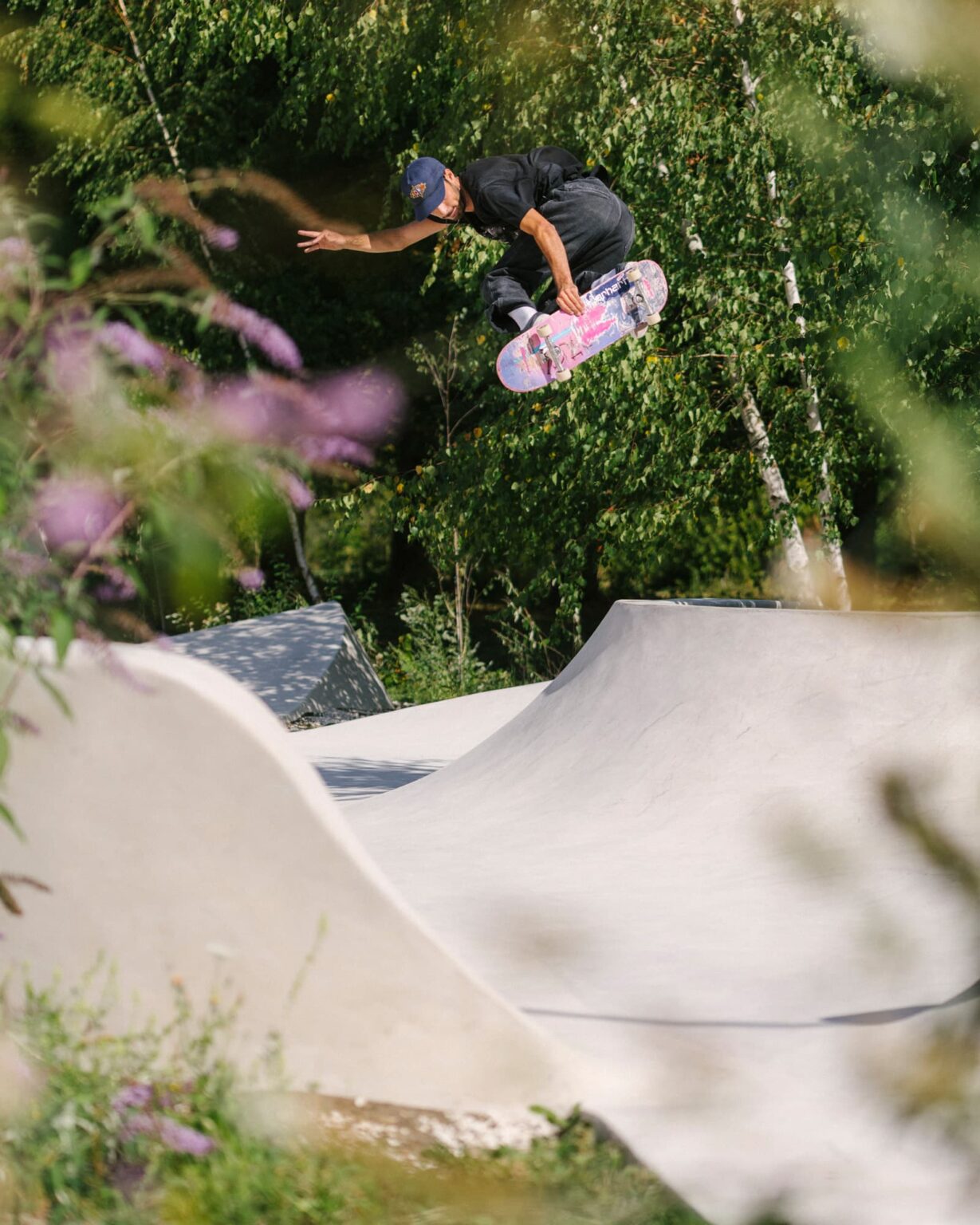
Designed as a continuous layer avoiding elementary divisions, the skatepark is intended as both a structure for the landscape and as a container. Stretched along the old railway tracks which cross the industrial site, the skatepark winds through between trees and shrubs. From the entrance of the site, it is visible by a few shapes that jut out above the vegetation. By its length, it binds buildings in this distended territory. The curved line of the raw concrete welcomes the shadows of the lime trees, poplars, birches and buddleia that hide it. The first sketches consisted in setting up a logic of forms that reacted to the specificities of the terrain and the existing vegetation. The shape is deducted from the interpretation of what was here. The construction explored the possibilities of wet-sprayed concrete. On site, metal frames were curved, assembled and welded. They are the lineaments of the project. The fresh concrete was sprayed directly onto the metal reinforcement, then pulled and smoothed to the desired shapes before setting. The making of the skatepark is largely empirical, mainly the result of the dexterity of the mason-skaters in charge of giving it shape. The construction site is run as a performance that celebrates the encounter of a project and a site.
By converting former service rooms into apartments, the original division between residents and serving floors is abolished. The prolongation of the elevator will connect these previously separate areas. Project interventions, such as creating an opening between the top level and the lower inhabited floors, will disrupt the hierarchy by placing a former service floor at the top, emphasized by a specific color treatment. Similarly, the renovation of the apartments does not erase traces of the previous occupation of the floor. On the contrary, they reveal the former structure and add a new layer to the history of these places.
Somewhere in the Grand Paris, the house rests at the foot of a tower. It marks the entrance to a residence composed of 20 identical semi-detached houses built in the early 1980s. An okoume plywood sliding interior facade hosts two closed beds, a bathroom and a dressing room. A large bay opens onto the enclosed garden, invisible up until now. A vast carpet, conveniently pierced, highlights the existing staircase and the objects around. A curtain wall separates the master bedroom. A couple of mobile desk-closets move around as activities take place. Fast and economical, the project is elaborated with common, available materials. The renovation, without finish, reveals the traces of the previous layout of the house. On the remnants of a nuclear family structure, the project is intended to be a liminal infrastructure, supporting the new idea of a mobile, changing, and adaptable family.
The interior is not absolute. As a living space, it provides the framework for life, but is itself affected by the lives led within it – by their necessities and contingencies, routines and circumstances, capabilities and needs, their degree of control or laissez-faire. Occupying a building means interpreting it – adjusting, modifying, transforming, selecting, rejecting. Behind the permanence of façades, an internal metabolism generates a life of forms that is correlated to the diversity of forms of life. A study of domestic interiors provides valuable information on issues that are critical to the future of architecture. This study, led on the occasion of the curation of the Belgian Pavilion for the 14th Venice Architecture Biennale, is based on empirical material derived from thousands of photographs of home interiors. They were taken throughout Belgium over a period of five months. The research attempts to provide terminology and illustrate behaviours that, beyond form alone, help to define a specific culture for these transformations.
"Interiors. Notes and Figures" is the name of the research we conducted on the occasion of the 14th Venice Architecture Biennale, and presented in the Belgian pavilion. This study is based on empirical material, made up of thousands of photographs of home interiors, taken throughout Belgium over a period of five months. It attempted to provide a terminology and to illustrate behaviours that, beyond forms, would help to define a specific culture for interior transformations. The architectural project in the pavilion is an initial interpretation of the research findings, by transposing remarkable typologies in the space of the Belgian Pavilion.
On the 11th floor of a tower, in the Point du Jour residence designed by Fernand Pouillon, partition walls, as well as a bearing wall, have been removed. In order to take advantage of the double orientation, the volume is thought as a flat territory without separation. Scattered volumes, enclosing objects, organize dedicated rooms: cloakroom, office, living room, studiolo, bedroom. Slanting, without alignment, these pedestals sequence the space. They offer a double circulation, generate shadows and multiple views. Domesticity is thought here in the manner of a landscaped garden that one constantly walks through.
The main floor of this Parisian building now houses a series of exhibition rooms and the offices of an art gallery. The traditional "white cube" is replaced by white fragments: there, a ceiling, there, a partition, there, a beam. Traces of a hitherto hidden past remain - flowery wallpapers, cracked walls, bowed floors - which cohabit with the artworks to come.
The architectural, urban and landscape manifestations of this project are based on three objectives intended to ensure the quality and the comfort of these home-ownership units: 100% of the units are south-facing, 100% of the units are open on both sides, and each square meter of living space equals to one square meter of outdoor surface, private or shared. The project, designed in modular wood and prefabricated construction, aims to offer a type of housing that compiles and rearranges the qualities of suburban housing: the presence of nature, the size of the exterior and a feeling of intimacy; with the advantages of collective housing: shared spaces, sociability and reduced impact of the habitat on the environment.
A landscape of rudimentary devices presents the cartographic research of the Institut Paris Région at the Biennale d'Architecture et du Paysage 2022. Composed of raw materials, direct materialization of the exhibition's research subject, the scenographic proposal is immediate. All the materials used are sourced within a hundred-kilometer radius of the exhibition site. Plasterboard, mud bricks, rough gypsum blocks, site lighting: all these supports evoke the ground and the underground in its successive strata.
The house of the squire of the Château du Marais becomes that of a couple of collectors. Double circulation and peculiar styles are privileged for each room. On the mineral ground floor, sits a ceramic fireplace, designed with the artist Mimosa Echard. On the first floor, a sophisticated library emphasizes the space. A house conceived as the setting for a vaudeville for these residents and their artworks.
Grand Matabiau is a new gateway to the city. The district must mark Toulouse's metropolitan scale, while maintaining continuity with its heritage and landscape, to become the missing link between the historic center and the suburbs. Building for users recognizes the need for a diversity of uses to build a rich and peaceful neighborhood life. Making a home out of the things that surround us means reconciling individual and shared time. Access to local services and the sharing of what we call the commons are essential to catalyze the social life of this new district.
A stone house in the center of a village in southern France escaped the rehabilitation of the 20th century. This building without use has taken on a structural role in the landscape. It outlines the silhouette of the village. Formerly forgotten, now domesticated. Dust of a century is removed, and soon water will run.
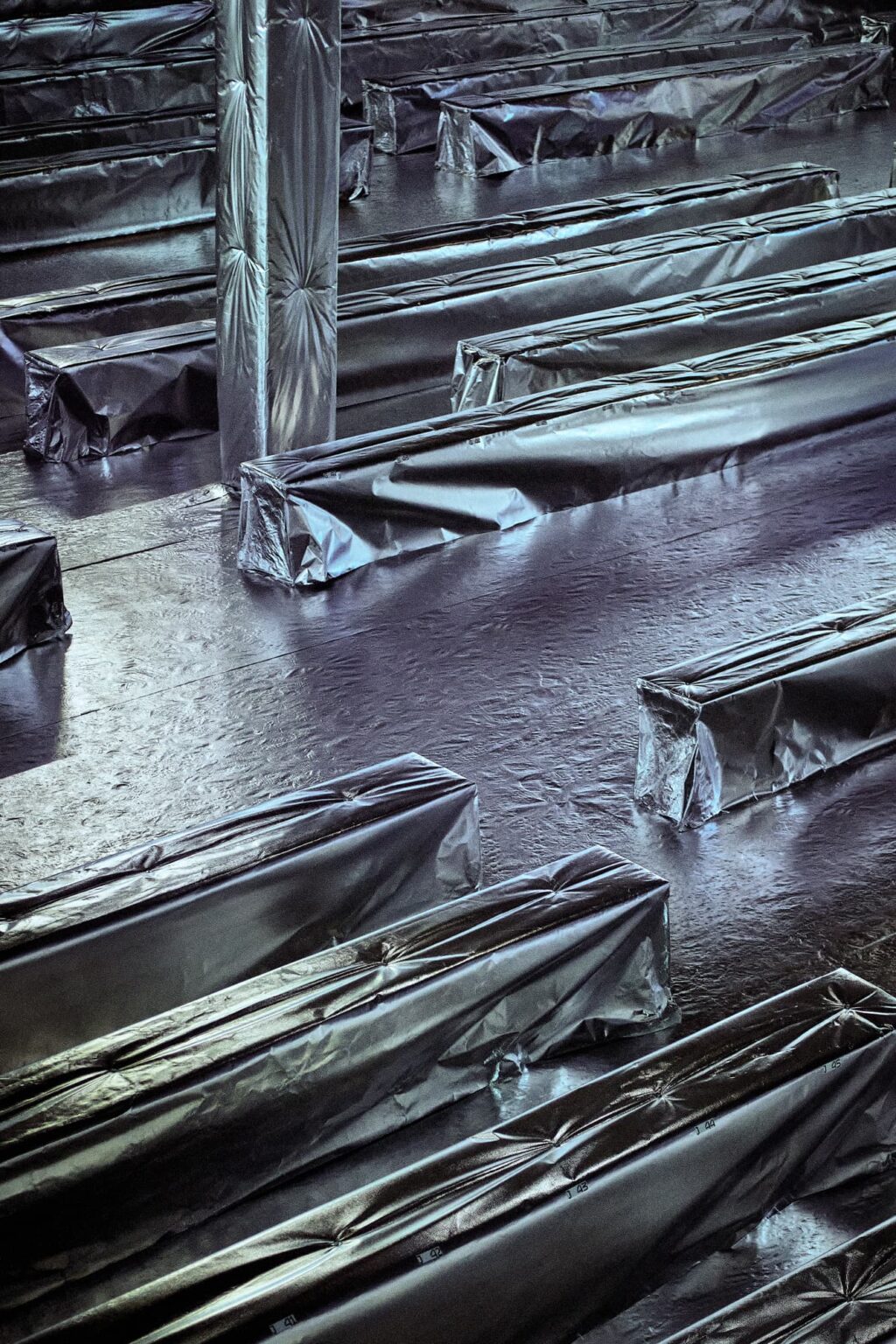
Bakelized plywood, usually covering the floor of trucks, is used for the construction of a range of exhibition displays. The mounting of artworks and the fixation of wood panels are made explicitly visible. From the transport to the hanging of the works, the scenography stages the logistics behind the circulation of artworks.
Plan Libre is an architectural monthly journal produced by Maison de l'Architecture Occitanie-Pyrénnées since 2001. Originally conceived as a professional newsletter and a space for debate for architects, the journal has extended its editorial line beyond its regional borders. Plan Libre wants to be an editorial space for independent architecture. The journal is built around four types of contributions: an investigation, a critique, a project and a portfolio. These different formats allow practicing architects, teachers-researchers, artists and curators to gather around a different theme every month.
The project consists in the rapid, low-budget transformation of a vast office space in a Haussmann-style building. The consultation carried out with the future users revealed the obsolescence of the space in the face of collaborative work, defined by intense pendulum variations, by a reticence towards closed spaces and a mistrust of overly open spaces, perceived as a disturbance to concentration and confidentiality. The project synthesizes different typologies of work spaces. Assigned, isolated offices. Collective, open spaces. Informal, mobile workstations. The features of the tertiary era (false ceiling, carpet, corridors), are demolished. Partition walls are pierced with bays, to let light and sights pass through. Following the update of what was there came a furnishing arrangement. On the reflecting grid of the floor, rudimentary tables and benches taken from Enzo Mari’s Autoprogettazione, made out of birch plywood, cohabit with industrial furniture. A collection of plants in wheeled cargo cases move around to accommodate users’ needs. Mobile phone booths, vaguely anthropomorphic, are the main protagonists of this landscape of scattered objects.
An old farmhouse is transformed into a house. The building is divided into two parts, occupied at different times of year. On cold days, the inhabitants live in the heated, insulated, converted part of the house. On sunny days, they spread out their activities in the rest of the building, left as it is.
A small week-end house in Brittany for two surfers and a car.
On the edge of a calcareous plateau, facing the Dordogne valley, small groups of old oaks are scattered on a sloping terrain. One should live there without disturbing. The village is on the facing hill, topped by a castle. On this preserved land, the house nestles in the topography. The 37-metre long volume is covered in stones collected on the site.
A former upholsterer's warehouse, located in the heart of the flea market in Saint-Ouen-sur-Seine, France, this mixed-use space serves both as a home and as the workspace of an architecture agency. The volume is long and narrow. The technical functions of the space are consequently leaned along the same wall. The walls, adorned with galvanized steel floor plates, reflect and disperse the light that penetrates this rather dark space.
This research explores the spaces produced by skateboarding culture. Based on a collection of magazines and the writings of Iain Borden, the exhibition attempts to reconstruct all the typologies that skateboarding has shaped. Beyond the skatepark, the examination of skateboarding practices informs the evolution of public space in Western cities. Besides this historical and theoretical approach, a photographic mission recorded existing skateparks on the French territory.
Adventures close to home is a series of monofunctional tables in bleached ash wood. Supporting a single object (table-cup, table-computer, table-plant), their combination creates domestic totems. They confront hyperfunctionalism with reminiscences of architectural motifs.
HIT is a horizontal library. It is bulky and choreographs the space it occupies. Depending on its position, the books can be considered by their spines or by their covers. HIT is a strong form, a support and a surface, oscillating between a raw material and a finished object. Homothetically, the form becomes a pasta that, by virtue of its geometry, can be served with any sauce.
Moving walls conceal an archive, an LED strip meanders across the ceiling, and a rubber surface characteristic of public swimming pools covers the whole floor. A whatever room, part exhibition, part conference and office space, fits into the first floor of an existing building. A window in the back overlooks a shopping center and reveals the aberration of the urban situation.
The Brexit Monument is a shape with the size of a continent. An ellipse with a height of three kilometers, linking the shores of Great Britain to those of continental Europe. A continuous white wall, blind and creased, cuts across land and sea. Visible solely on the digital layer of the world, it needs a screen to reveal itself. Monumental yet intangible, it commemorates the seriousness and the inconsequence of the day Britain decided to leave Europe.
Iudo assists homeowners in the realization of micro-promotional operations in order to densify suburban areas. The extension of a house on a corner plot becomes a framework for experimentation. To an existing pavilion is added a metal lattice that conceals a second house and exterior rooms that open onto the garden. Gradually covered with vines and caducous plants, this secondary structure gives the construction an ambiguous limit. The light passes through, while making the extension autonomous from its surroundings. It offers its inhabitants the amenities of a seasonal domestic environment.
Generated from the deformation of an elemental storage unit - four voids for one block - this collection of portals houses all the objects that fill the gallery. The variations of thickness of the marble furniture explain the operations of stretching and compression which numerically gave them form. These elements constitute the central piece of the gallery's redesign. Placed in the window, Grandi Bianchi shows the ecosystem of an art gallery as a place of administrative, economic and social activities.
Using the exhibition House For a Superstar (Arata Isozaki, 1973) as a point of departure for the reflection, this exhibition questions the hyper mediatization of architecture. Alongside documents from popular and architectural culture, five agencies were commissioned to design a house for a media personality of their choice. Between political fervor, stylistic enthusiasm and architectural disappointment, the exhibition proposes a peculiar mixture of constructed material and representations, product of a mediated postmodernism, a "Decaffeinated Double Ristretto'', as Charles Jencks liked to call it.
With no a priori function, this form can be used in an infinite number of configurations. This structure oscillates between the support and the surface. Without any assembling, the production of this object is based on a unique action, the cutting of a brushed aluminum plate based on a digital drawing. It becomes an object seldom designed by architects: a clothes airer.
Small, portable and without foundation, the Stugan house is both a tourist attraction and an everyday home. Designed to be produced in large numbers, the Stugan house is a synthesis between the hedonism of paid vacations and today's ecological concerns. A form of habitat for a joyful degrowth.
Itsas gela, Pieces of the Ocean, is a research project started in 2017 at the invitation of a group of citizens federated within the Nouveaux Commanditaires action wishing to demonstrate the effects of global warming in the Txigundi Bay. This Franco-Spanish cross-border territory is subject to physical phenomena that modify its landscape: progressive silting, disappearance of beaches, retreat of the coastline, acidification of the water. After a field survey, we are experimenting with a process of rock accretion capable of producing a range of small monuments in an underwater environment, which are then raised and placed on land. Developed by Geocorail's engineers, the electrochemical process allows the production of a rocky agglomerate from materials present underwater, such as sand or shell debris. A submerged metal frame is supplied with a very low voltage direct current. Under the effect of this current, the mineral salts naturally dissolved in the sea water form compounds which precipitate around the framework and solidify in the manner of a synthetic rock. A rocky gangue is gradually formed by accretion. The aediculae give a tangible form to the geo-sea history of the estuary. The accretion time of at least one year transforms the construction site into a silent ritual, out of the human mind. The monuments are built by the sea.
Folies are contemplative landscape devices, concerning singular situations and architectural discipline. These small buildings are territories that allow stylistic experimentation of architectural practices, concepts and multiple rituals. Ruins, grottos, shrines, tents and temples are figures reflecting on the existing architecture, its relation to landscape and its economy. The folies are at the same time critical and anticipatory projects. The exhibition took place at Kanal Centre-Pompidou in Brussels in 2019, in partnership with the CIVA Foundation. It explores new architectural, landscape and literary shapes related to folly parks. Beyond historical fetishism, through a critical mass of projects displayed, this exhibition discloses the subject’s contemporaneity to think the city as an ensemble of emergences.
The estate of actress Maria Casarès has become a theater residency. In the park, a footbridge links the house to an island. Simple but with ample dimensions, the bridge becomes a possible stage for country spectacles.
Going through the history of a chosen type of entertainment institution, the nightclubs, this research outlines the genealogy of an experimental architecture that positions light, sound, movement and psychotropic drugs as catalyzers of social and physical space. The book and resulting exhibition span from the end of the 1960s with the construction of the Italian Pippers and the first architectural avant-gardes until the early 2000s with the progressive closure of nightclubs. It is the second part of three exhibitions dedicated to the architecture of entertainment venues. Exhibited architects: Didier Fiuza Faustino, Pietro Derossi, François Dallegret, OMA, Patrick Berger, Leopold Banchini, Daniel Grataloup, Daniel Zamarbide, Nicolas Dorval-Bory, Ippolito Pestellini Laparelli, Andreas Angelidakis, Superstudio.
In 1984, Cornell University in America developed a system in order to measure the precision of images produced by 3D simulation software. This calibration tool works by comparing a real photographed scene and a virtually generated image. The scene is an opaque box, the wall on the right is green, and that on the left is red. The rest of the surfaces are white. From the ceiling a rectangular light illuminates the scene. Two opaque volumes, a cube and a rectangular parallelepiped are placed within this environment. The comparison between the photograph of the model and the computer generated image thus allows for the calibration of several characteristics of illumination: radiosity, specular reflection, diffuse reflection, refraction. The Cornell box and nightclubs share the same programme and a common tool: the simulation of an abstract reality through light. For the creation of the temporary nightclub within the villa Noailles, Nicolas Dorval-Bory (born in 1980), Benjamin Lafore and Sébastien Martinez-Barat (born in 1983) have taken inspiration from the Cornell box, limiting their design to an exploration of luminous phenomena. An existing volume is divided by three coloured bands, red, green, and blue, which each reflect a part of the spectrum. A collection of devices, a stroboscope, ultraviolet and laser lights, emit changing lights which are reflected in a rotating dodecahedron, a simplified version of a disco ball. Three white volumes reflect these beams of light. The space is thus produced via the emission, reflection, and diffusion of light.
Folie, Welcoming Roof is an entrance pavilion located in the courtyard of the Kyoto Art Center. Three roofs are stacked on top of each other. On each of them, curved areas of horizontal wooden slats create opaque surfaces that protect against the rain, while vertical slats filter the sun. Arranged this way, these elements project on the ground a complex shadow map suggesting various uses, depending on the different qualities of light and temperature. As the first inhabitants of this construction, shadows describe changing situations. More than a building with strong and permanent forms, the roofs become filters, proxies compiling striped shadows in various orientations. This elementary device qualifies the space according to the movements of the sun. An architecture whose effects take precedence over its materiality. The pavilion is made of Japanese cedar according to the methods of Japanese carpenters, without foundation and entirely dismountable.
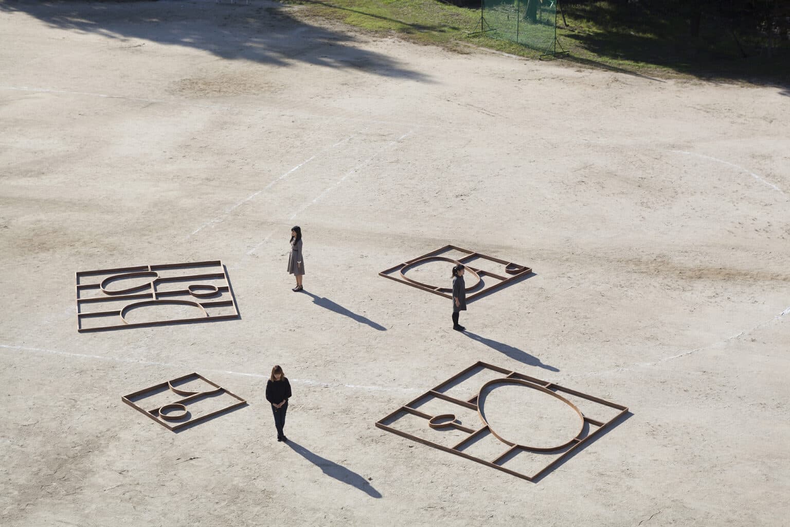
Folie, Templates is a group of pavilions composed of a set of lines that spatially organize communities of objects and communities of individuals. Their form results from the meeting of a system of measure: tatamis, with spaces to be used according to each situation: curved lines. The project explores the notion of kekkai specific to Japanese spatiality which designates forms of thresholds closer to the constructed sign than to the coercive limit. Between foundation and ruins, this infra-architecture reduces its means to emphasize its effects.
A 19th-century townhouse, La Brigantine is composed of an enclosed garden, a notable facade and a succession of rooms spread over three levels. On the first floor, a light concrete surface organizes the entire floor. Outside, loose forms lead the entrance sequence and arrange the surfaces meant for use and for planting. Inside, extruded forms support and surround selected objects. These areas organize and polarize the floor of the house. Translating the client’s wishes into the program, the curves accompany and choreograph the movements of individuals, the displacement of objects and the territories of plants. White metal structures, contrasting with the now pink facade, generate additional rooms: a pergola and a mezzanine.
At first sight, the viewer is struck by the critical mass of the collection. By placing pieces of different formats and periods in equivalence, the arrangement gives an account of the eclecticism of the collection. A more attentive wandering allows the visitor to grasp the connections, the parallels, the figures chosen by the curator. As Michel Serres indicates in the Five Senses, "to perceive is to stand". The display favors consideration: it offers everything at first glance, but allows an attentive reading of the work to those who sit down, who modify their posture, to the one who takes, with his body, the time of observation. The display is rudimentary in its implementation and explicit in what it proposes: an organized arrangement of works.
The transformation of this industrial space into an artist's live-work space relies on the treatment of the surfaces of the surrounding walls. The explicit composition of the thickness of the wall makes it possible to locally determine the qualities necessary for the considered uses. No more, no less. The project then becomes the superposition and arrangement of several qualities of insulation, rigidity, waterproofing, and finishing on the existing walls. The reflection on the optimal qualification of the vertical surfaces distributes uses and objects. The peripheral surface organizes the space and generates domestic scenes. All the designed furniture are the volumetric doubles of objects of first necessity.
Like a full scale model, L’Outfront is a wooden house whose form explicits the operations that led to its construction. It is the result of a few simple formal manipulations. A pierced vertical surface, repeated at regular intervals, generates facades and interior volumes. The grid is then truncated by the slope of the land and the restraints of urban law. On the northern façade, large bays open onto the garden landscape. The eastern façade, hatched like a cross-section, reveals the five walls of the house. Inside, the repetition of shear-walls articulates spaces, without limiting them. L’Outfront is a legible structure and a strong form that can accommodate unexpected uses. The structure of the project is entirely made of wood. Project nominated for the EU Prize: Mies van der Rohe Award 2015
Like a rock whose potential is opportunely discovered, the Stanzes experiment with the notion of tacit design. Functions are possible, imagined but not specified. Thanks to the indications of their use, to their familiar scale, to their formal intuitions, the Stanzes solicit an active appropriation. They are situated in a temporality beyond use, with the permanence of a landscape feature. Offering nuanced shelters, varied seating postures and diverse modes of sociability, they can be equipped as needed, with wifi screens and interactive terminals, for an enhanced exteriority.
